 RSS 2.0 feed
Paint-in #3: a slight diversion
Posted by Martin on March 3, 2013
This is by way of being a small interlude to address a potentially thorny little topic that we’ll run into later on in painting the BfK Limited Edition figures. I thought that by covering it now, it would give you all advance notice. So what is this strange little diversion all about? Well, it’s another case of the French penchant for highly poetic if awkward names for the colours of cloth they used in their uniforms. You may have run into some examples before like “lie de vin”, “aurore”, “capuchin” and so on. The one that concerns us now is “gris de fer” because it is the main colour of the uniforms of French soldiers of the artillery train (and the baggage train too – more of this below).
Translation of the name of this colour into English presents only a modest challenge: it simply means “iron grey”. But that’s where the fun starts. What exactly is iron grey and how can we represent it when we we wield our paintbrushes? Let’s start by looking at the first of those two questions. Gris de fer is generally regarded as a grey-blue colour not dissimilar to sky blue but duller (or, dare I say it, greyer). Finding good trustworthy examples to inform us about what this actually looked like isn’t easy because few uniformologists and books pay much attention to backwaters such as soldiers of the train. Luckily, two of the very best have devoted some of their energies to this subject.
Let’s start with Knotel. There are two plates of interest: Band XVI, Plate 34, which depicts a trumpeter of the artillery train in 1812-13 (and, perhaps more interestingly for this posting, shows a number of artillery train soldiers in the background), and Band XVIII, Plate 29, which shows baggage train soldiers from 1807. Life isn’t helped by sky blue still often being in use instead of iron grey in 1813 but you can get the idea of things from these two – both shown for your delight below:

Knotel Band XVI Plate 34: French artillery train trumpeter 1812-13.
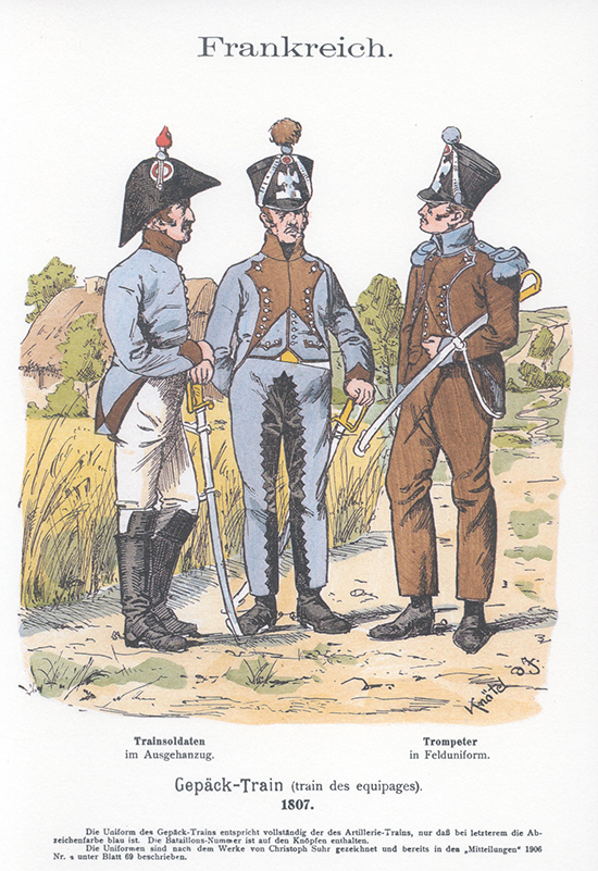
Knotel Band XVIII Plate 29: French baggage train soldiers 1807.
What I can’t show here, for copyright reasons, are the Rousselot plates covering the artillery train. These go into much greater depth and show a wide range of detailed uniform variants but, for the purposes of this discussion, iron grey is shown as a bluer and darker colour – frankly much closer to sky blue.
Of course, we also have to put these colours in the context of real life on campaign in the early part of the 19th Century: dyes were organic rather than chemical, there was no centralised supply system so individual local factories produced uniforms and campaign conditions were harsh. All of which would have led to tremendous colour differences in supplied uniforms that was only made even more variable by the effects of sun, rain and wind.
So, on to the second question: how to choose paints for iron grey. First, I’d like to point out that you have the legitimate option of clothing your artillery train soldiers in sky blue for which there are already easy paint choices (several Vallejo colours conveniently identify themselves as suitable by including “sky blue” in their names and I’d recommend them). However, I’m going for the iron grey option and I know, from previous experience of trying to represent blue-grey uniform colours, that this is an awkward job – especially when you’ve got to try to find a basecoat, first highlight and second highlight (at least) that match tonally. To cut a long story short (you really don’t need to hear about all the trial and error experiments I’ve conducted) I’ve settled on four paints:
- Basecoat: Vallejo VMC964 Field Blue – a mid-to-dark grey with the definite blue overtones that are needed for iron grey.
- First highlight: Vallejo VMC943 Grey Blue – now, I think this one is optional and you could miss it out of your iron grey palette. Give it a go and see what you think.
- Second highlight: Andrea NAC-24 Union Blue – Quite close in colour to the previous one but slightly my preference. But it’s a personal subjective choice.
- Third highlight: Andrea NAC-17 Azure Grey – this is a much lighter colour, so use it sparingly for final highlights.
In the next paint-in posting, you’ll see where I’ve started to use these colours on the figures’ lentille pompoms. In the meantime, feel free to comment and share your own recipes.

Giles said
Hi Martin – I settled on the Foundry set “Confederate Grey”, palette 117 (I know you don’t like Foundry paints much; this set is not as “plasticy” as others). That seemed to me to be the best match to the more modern illustrations I’ve seen in the relevant Ospreys and the Griffith/Bukari “Napoleon’s Artillery” book. It’s more grey than sky blue, but my personal preference here is to avoid sky blue, not least because I think it can be a tricky colour to highlight effectively. As you say, it’s a bit “pays your money and makes your choice”, given the very unhelpful descriptions Napoleon gave to his uniform colours!
Funnily enough, I find that the most difficult painting decisions are often over things like the colour of whips, gloves, canteens etc that probably don’t matter much. For example, the drummer has a canteen type that I haven’t come across before (looks like animal skin?) which I just painted a standard brown as I had no idea what else to do! So I’m looking forward to seeing more of your decisions re these lovely figures.
Giles
Martin said
Hi Giles,
I suspect there are several of the Foundry triads that might be suitable depending on individual taste. The one that sprung to mind when I was researching this topic was “British Blue Grey 75” though several others have potential: “British Gun Grey 108”, “Union Trouser Blue 112” and the one you’ve gone for to name but a few. As you know, I don’t have a happy relationship with Foundry paints so I didn’t take the matter as far as buying any of these to try for myself. I’ll be interested to hear how you get on. For what it’s worth, like you, I favour a shade at the greyer end of the spectrum rather than one at the sky blue end for this particular job. When I paint sky blue, I don’t have such a problem with highlighting – I go for Vallejo Deep Sky Blue (VMC844) as a first highlight followed by Vallejo Sky Blue (VMC961) as a second highlight. Quite a few mid or dark blues will work as a basecoat under those.
You make an interesting point with colour choices for uniform and equipment ephemera. Rather than see these as a difficulty, I tend to treat them as an opportunity to express myself and give figures a little hint of individuality. The drummer’s canteen you mention is indeed intended to represent animal hide. In this case, I’d probably go for a red-brown palette but if I’m feeling artistic, I might add some creamy-white patches rather like you sometimes see on French soldiers’ backpacks.
If you’re going to Salute in April, I’ll be there so it might be fun to meet up and compare notes.
Congratulations to you and the Kiwi on your new baby BTW!