NOTE: This is an archived version of the first incarnation of Brand New. All posts have been closed to comments. Please visit underconsideration.com/brandnew for the latest version. If you would like to see this specific post, simply delete _v1 from the URL.
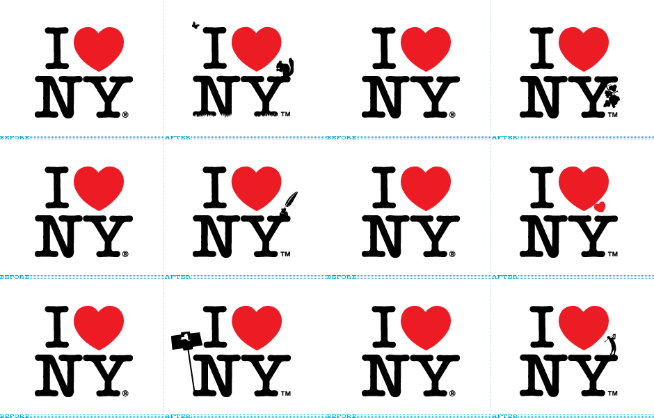
Back in May of 2007, it was announced that advertising agency Saatchi & Saatchi had been awarded the I Love New York campaign run by The Empire State Development Corporation with an alloted budget of approximately $17 million — budget that goes into the production and media buys, not into Saatchi’s pocket as some people have misunderstood — to promote tourism for the state of New York. The first set of print ads came earlier this year and the now infamous logo with a squirrel on it has been popping up regularly but for some reason there is a rekindled interest in this story and some fun material has come up, so we are happy to give this the attention it deserves.
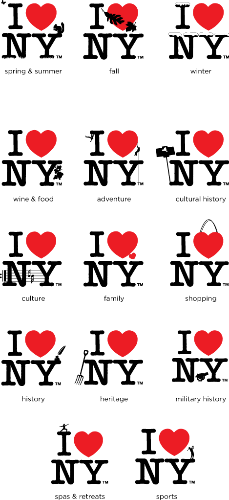
The biggest concern when I read about Saatchi getting the job was that they would be a little too eager to change the 1977 logo designed by Milton Glaser, in an attempt to get some attention and show how clever advertising agencies can be. Luckily, the I ♥ NY remains the same… except that it has grown some actively annoying clip art appendages. These, along with the print ads, are meant to show how diverse New York is and to establish the I ♥ NY icon as representative of the whole state, not just Manhattan.
In theory, the idea seems good, to activate the logo in different ways, but the execution is so timid and half-hearted that it is barely convincing or engaging and, at best, it looks like the cheap knock-offs that the The Empire State Development Corporation fights so furiously in getting off the market. The print ads are actually not bad; the illustrations lend an interesting contrast to the usual tourism ads, giving it a somewhat edgy feel.
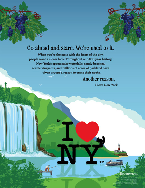
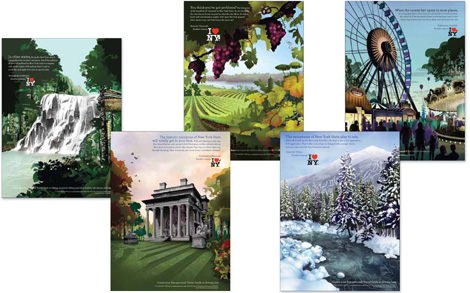
Somehow a PDF of the identity guidelines for the campaign has been posted on-line, and unless someone says it shouldn’t be, you can see them here [PDF].
Major props to Jim Edwards who posted in detail about this and has some of the best links about this story.
Thanks to Mr. Frankie L. for the tip.

Jump to Most Recent Comment
Dale Campbell’s comment is:
Yeah,
I think the original I (heart) NY logo is obviously so well known that it doesn't necessarily need to be tinkered with.
I understand the idea of showing NY as diverse, but I don't necessarily agree that you need to show that in the logo but within the campaign that is developed instead. No?
For instance, to me, the ads developed would look just the same wit the original logo.
What do you all think? Just curious.
Keep well,
Dale

John’s comment is:
Can the TM be any larger? I can't see it. Make it Bigger.
On Nov.21.2008 at 11:21 AM
Fink’s comment is:
I agree with Dale... STU. PID.
Meaning behind manipulating the logo, I understand it but it seems a little too easy to come up with this concept, you have millions to work with, not hundreds or thousands.
On Nov.21.2008 at 11:22 AM
Christopher’s comment is:
and, at best, it looks like the cheap knock-offs that the The Empire State Development Corporation fights so furiously in getting off the market
Oh but I think you may have the answer right there. This is sort of a "if you can't beat them, join them" moment.
So now they've basically created (and will be able to license and put on t-shirts, coffee mugs, shot glasses and snow globes to sell to willing tourist/consumers) what people were already creating and buying themselves.
It's a brilliant bit of giving the people what they want in the grand tradition of American marketing!
On Nov.21.2008 at 12:10 PM
koyo’s comment is:
AGREE. Please don't touch the master's MIlton Glaser work !!!
On Nov.21.2008 at 12:17 PM
rickyaustin’s comment is:
I was always under the impression that I♥NY was for NYC and not for NY State. Atleast that's how I've always thought of it.
So initially I was thinking "what the hell?", but in context of the state I suppose it makes a little more sense.
If the entire campaign was set up as people usually see the logo - as a stand-alone thing on a (usually) solid color, then I guess I can see the point of adding something to it, as Glaser did after Sept 11. I wouldn't agree with it, but I could understand why.
These marks just aren't as clever as Glaser's original or 9/11 mark.
Since these are part of a larger print campaign, I don't see the point of adding anything to the mark. The print ads tell me 'winter', 'autumn', 'pitchfork'. Tacking on little bits to the mark doesn't add anything. It simply makes it look overworked and degrades the iconic mark in my humble opinion.
The entire print campaign... Underwhelming, but probably will be deemed effective.
I'm sure Glaser will hate this.
Overall... "Meh."
On Nov.21.2008 at 12:46 PM
Yeison Agudelo’s comment is:
I LOVEEEEE IT living in new york myself im ecxited to see these ads now
On Nov.21.2008 at 02:13 PM
jean claude vanMammal’s comment is:
I love NY TM? i dont love the New York Times!
i do love Milton Glaser though. Change the TM to MG.
On Nov.21.2008 at 02:14 PM
Rich’s comment is:
Augh! The "culture" one has the repeat mark backwards -- at the beginning of a line, it goes thick, thin, then dots. And the 16th note with its stem going upward has its flags going the wrong way; they should be to the right, not the left.
At least they got the number of lines right.
On Nov.21.2008 at 02:25 PM
Anonymous’s comment is:
The butterfly looks like a double or curly single quote. Can't shake it, even when I realize what it is.
On Nov.21.2008 at 02:31 PM
Rob’s comment is:
If youve already made illustrations on the logo, why put that in another illustration? Whatever integrity the new logos have gets lost in these stupid illustrator drawings. I don't understand what the style the ads are rendered in is supposed to be saying.
???
On Nov.21.2008 at 02:33 PM
Mrs. M’s comment is:
The only one I kind-of dig is the shopping one and that's only because it's so endearingly twee.
On Nov.21.2008 at 02:54 PM
Philip’s comment is:
I think Christophe Szpajdel should have redesigned the logo.
On Nov.21.2008 at 03:16 PM
Jonathan’s comment is:
The manual goes into specific font detail, but doesn't site that terrible headline font. I forget the name of it, but its a terrible grungy-serif, and its just awful!
As for the new logos, you lose the details in those illustration ads, they just look like part of the artwork. Nothing too amazing here.
On Nov.21.2008 at 03:18 PM
Nick Irwin’s comment is:
I am pretty sure I got the "winter" one on a shot glass purchased at a small shop in time square back in '99!
On Nov.21.2008 at 03:27 PM
Nick Irwin’s comment is:
gotta admit I like the ads though all warm and fuzzy what ever that means
On Nov.21.2008 at 03:30 PM
George - LogoDesign.org’s comment is:
Shame they have to tinker with it and can't just let an awesome logo well enough along. There are so many ways they could use it without adding junk to it.
On Nov.21.2008 at 03:35 PM
JBIII’s comment is:
Oooffffaaaaaa......
I love squirrels in New York
I love to leafs New York
I love snow in New York
bla bla bla
What a cluster&%$# of logos.....
Has MG commented yet on these?

Chris ’s comment is:
This looks like a freshmen design homework assignment...
On Nov.21.2008 at 04:06 PM
marnie’s comment is:
I can see some of those working, say if they were animated. Some snow falls on the logo. A squirrel scampers up. Someone opens a tiny door in the heart and rappels down...?
But I didn't understand what half the clip art was supposed to represent. I assumed the pitchfork was... farming? The grapes, also farming (vineyards). The pen and ink... great writers of NYC? Squirrels say fall to me, not spring, but whatever. And I still don't know what the cultural history thing is supposed to be. Not to mention the fact that none of it makes me think of anything other than NYC. (I did wonder about the farming...)
Overall, though, I agree with Dale: not only is it ineffective, it's largely unnecessary.
On Nov.21.2008 at 04:22 PM
Anonymous’s comment is:
I definitely thought that shopping bag was the St. Louis arch. I don't understand the cultural history either, and think the spa logo could easily be mistaken for sport, adventure or culture. And I don't think the person dangling is necessary in the adventure logo, I don't understand what's he's doing, yes dangling is adventurous but how is that particular to NY? Now a man in a barrel falling, I would have understood.
As someone from central NY (with a mild disdain for you islanders :) ) I agree with the comment that I love NY refers to the city, not the state. It seems that the state is trying to capitalize on the well known logo.
I do like the look of the ads, but don't think they needed to mess with the logo.
On Nov.21.2008 at 05:04 PM
David’s comment is:
I give up. What the hell is that on the "cultural history" logo?
On Nov.21.2008 at 05:23 PM
Lester’s comment is:
Where's the bevels, gradients, and drop shadows? A little 3D would be nice. Also would be nice if they changed the text to a modernist sans serif, to fit in with the rest of the 21st century's logos. Get with the program, Saatchi!
Just kidding.
I agree with Dale, this would work best if they didn't tinker with the I Heart N Y logo at all, and just let the background illustrations in the ads do the talking. With the spring/summer one, I really had to look at it for a few seconds before I realized that ink splatter in the upper left was a butterfly, and not a printing mistake. The leaves in the Fall one look oddly like one long leaf (perhaps a fern), stabbing through the heart.
It's interesting to read what Copyranter said about these ads back in May on Animal New York.
On Nov.21.2008 at 07:09 PM
Glenn Sakamoto’s comment is:
Let the ads tell the story and leave the logo alone!
On Nov.21.2008 at 09:30 PM
trevor f’s comment is:
i think the campaign is pretty nice. i will say that some of the details are a little small, but overall i do think they work.
On Nov.22.2008 at 03:51 AM
Moeed’s comment is:
Don't like it.
I don't understand why they would mess with the original.
Sorry Milt.
On Nov.22.2008 at 11:59 AM
Nisio’s comment is:
I'm quite so-so about this. I think the idea could have worked, if the execution had been better and the additional elements had some personality and consistency. If you placed all these elements on the same page I doubt they would feel like a family.
As it stands it feels a bit gimmicky and cheap.
Shouldn't this job have been handled by a branding agency and not an advertising agency?
On Nov.22.2008 at 12:25 PM
MUGGED.’s comment is:
OUCH. HORRIBLE. AMATEUR. EMBARRASSING. LAME. EVERYTHING.
WHY?
There are textbook design NO-NO's everywhere!
1. NEVER mess with a masterpiece
2. No consistency in the clip art style from piece to piece
3. Clip art style 'silhouettes' are inconsistent with the logo's inate 1-D simplicity. Some clip art are 3-D, moving back in space and others are flat, 1-D silhouettes. Others use symbology (See them all in the PDF) Others have varying line-width.
4.What's up with the reflection of the logo on the pond...AND the grass?
5. What is that thing that is holding the silhouette of the state of NY on 'Cultural History'?
6. The mirrored grape branches must be hanging from trees as they do in NY? And with the shadows are mirrored too!
The other 4 illustrations are excellent and are obviously done by a professional outside the agency. But the illustration of the man fishing with the grapes in the sky is very amateur.
With exception of the 4 professional illustrations, All the fundamental mistakes in consistency, layout, composition and design –this thing just screams AMATEUR!!!
$17k? Maybe.
$17M? Mugged.
On Nov.22.2008 at 01:38 PM
Gavan Michael’s comment is:
Has anyone worked out what "Cultural History" is all about yet? That's really beginning to annoy me??
On Nov.23.2008 at 07:21 AM
Jim’s comment is:
This is just a damn shame. I don't even know where to start with how freakin horrible this mess is. Why mess with the logo??? Taglines could have been added to accomplish the same thing, without destroying a masterpiece.
On Nov.23.2008 at 09:18 AM
Adam’s comment is:
People are calling the original logo a masterpiece. That may be true but if it came out today everyone here would be criticizing the font choice or the kerning or something else like always.
On Nov.23.2008 at 01:05 PM
Alice’s comment is:
I also think that this is an aberration; everyone already associates Glaser's logo with NY, why mess with it? Was anyone actually tired of it? Why rebrand? It seems forced.
Typography on the ads seems awkward, too. Especially the larger font on the ad, which isn't mentioned in the brand guide. It's taking the whole thing down a few pegs, to me.
I do like the way elements of imagery from NYC are incorporated into the illustrations that form the main image of the ads. Bravo on that.
The copy on the ads is irking me. "Another reason," what is up with that comma? There's no reason for a comma before the logo! The whole "playful" tone is coming across a little off. I read the other blog that Lester linked to above. It's spot on, there.
This campaign could really have hit it out of the park, but there seem to be many little details that just aren't harmonizing right.
On Nov.23.2008 at 01:26 PM
jennifer’s comment is:
Not impressed. It is almost sacreligious to alter that logo! Nothing improved it. It should have been used on the ad campaign as is. That would be like changing the Pepsi logo.....oh wait....
On Nov.23.2008 at 03:35 PM
Mr.Frankie L’s comment is:
To me this is interesting because it shows you what happens when an ad agency works on a logo, because would a design firm have arrived at this solution?
There are talented designers working at ad agencies no doubt and I don't consider this re-design the result of lacking talent or dedication.
I believe it's a matter of approach.
Conceptually, it's a good idea, it's what ad men get paid big bucks to do, and certainly the art direction on the ads themselves work well. But from the designer's unique point of view, there are matters of aesthetics that need need to work just as importantly as the concept. Like many have pointed out, the "clip art" elements are not consistent in perspective and from a distance or scaled down, they lose shape and appear as dark specs. They only work large, to be imprinted big on a t-shirt or poster. Then there's the matter of taking something so iconic and considered a masterpiece and tinkering with it; like placing a leaf on a nude sculpture by Michelangelo. Re-designing a logo of this stature is almost impossible to succeed in, which is why, from this designer's point of view, one should have contacted Mr. Milton Glaser himself to be hired to work on it, or at the very least be the design consultant.
On Nov.24.2008 at 01:25 AM
John’s comment is:
Honestly, after seeing it 5 jillion times in the 70's and 80's it's reappearance now is unwelcome (at best).
Can't we retire this logo to the annals of graphic design history? Why do we have to drag out every piece of successful design, slap a friggin' squirrel on it, and recirculate it.
I♥NY RIP.
On Nov.24.2008 at 09:49 AM
XK9’s comment is:
David and Gavin Michael,
The "cultural history" icon is a poor replica of the sign that denotes historical landmarks.
I grew up in the foothills of the Adirondacks. I remember the original campaign and that it represented all of New York State. (I even remember part of the theme song, "I love New York, what a great vacation...".
When the State stopped promoting itself, the logo became a souvenir bought on the streets of the City. The problem wasn't the logo; it was its ubiquity on the streets of Manhattan. The brand was co-opted by the City, not in a devious way, but by repetitive use.
I firmly believe that this kind of amateurish customization of a logo weakens it as an emblem of this "brand". Pairing the logo with a photo of Lake George would make a much better association than adding the silhouette of some bushy-tailed rodent. The mock-ups (please say they're mock-ups) for the ad campaign makes this point.
The vandalism done to Milton Glaser's iconic logo is criminal. Poor defenseless logo.
On Nov.24.2008 at 06:00 PM
Mark’s comment is:
looks ok not that great, I'm not sure if this needed to be done, also I'm confused what that thing is in the cultural history version? a sign? I'm confused.
On Nov.25.2008 at 08:06 AM
Chris Lee’s comment is:
This is weird. These "logos" are just extensions of the illustrations. The logo itself is not fundamentally altered -- they just made some clip art sit on top of it.
This can hardly even be considered a rebranding -- its a series of ads. In fact, I'd probably enjoy the ads more if they didn't say they redesigned the logo and just called this a new campaign.
On Nov.25.2008 at 02:29 PM
Mark’s comment is:
here's what the sign (that thing in the cultural history version) looks like in real life.

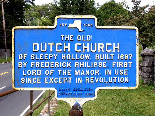
Never realized that the question was answered before.
On Nov.25.2008 at 10:15 PM
Mike’s comment is:
In the guidelines there's a slightly larger version of the ad with the snowy river.
Look in the snow. Faces.
Creepy.
On Nov.26.2008 at 11:19 AM
Gavan M.’s comment is:
XK9 and Mark: thanks for elucidating on what the cultural history thing is.
The mind boggles at the stupidity of going out of your way to put an unrecognisable blob on a stick on the I Love NY logo in an attempt to somehow improve it, at least contextually / momentarily / fleetingly.
I still think it looks more like something filled with helium tethered down and trying to blow away… but that bit might be just me.
On Nov.27.2008 at 07:01 AM
mia’s comment is:
mmm. what was the point of this? seriously? whats the concept? putting some images that represent things on a logo? this is a concept?
and maybe its because i am a south african, but the logo doesnt make me see stars like it seems to with other designers. cool? yeah. iconic? yeah. but... i mean how many times am i going to see this damn logo?
On Nov.27.2008 at 08:22 AM
Mark’s comment is:
frankly,when I first saw it the cultual history thing looked like a camera type thing,the should crop the sign so it looks better.
It does look like one of those cheap helium balloons you see in bargain stores,that come with a plastic stick rather than a string.
On Nov.28.2008 at 08:24 AM
Mark’s comment is:
frankly,when I first saw it the cultural history thing looked like a camera type thing,the should crop the sign so it looks better.
It does look like one of those cheap helium balloons you see in bargain stores,that come with a plastic stick rather than a string

Asharif’s comment is:
There are hidden images in each of the illustrated posters, pretty interesting!
On Nov.28.2008 at 11:33 AM
Alex’s comment is:
I don´t see the point of adding another tiny graphics to the original logo since it will be on a major seasonal campaign. I see here a semiotical contradiction, the world well known heart symbol mixed with (if not) clipart well defined graphics. Seems quite useless to use this tiny graphics when the logo is reduced for practical purposes... who will sincerely see that and feel moved to visit NY? The heart symbol is big and bold, the tiny graphics, well, tiny.
On Dec.01.2008 at 06:22 PM
Bruce’s comment is:
Brand dilution = bad for business. Seems like somebody had this done to justify earning a salary.
On Dec.02.2008 at 02:55 PM
amsterdandi’s comment is:
My first inclination is: Never (re)touch a classic!
I get it: seasons, culture, arts, cuisine, squirrels… Come see and love all that is NY.
Given the ubiquitous charm of the IHeartNY logo, and the pride it instills in even the most nomadic native son and daughter worldwide (myself included), it is understandable city PR and marketing execs were wary of too much change.
But merely tweaking such a classic logo so mildly not only fails to take advantage of über agency Saatchi & Saatchi’s strengths - it also sorely fails to justify the $17 million price tag. (focusing on logo for article commentary/using overall campaign cost, duly noted)
S&S is best at its most dynamic, and clients should be sure they’re ready for a trajectory change before commissioning at this level. More interesting would be a review of the rejected ideas before what seems like cold feet set it (by S&S or NY?). The city could have saved much on its budget by using someone in house. The resulting logo looks as if it did, anyway.
To quote an old SNL skit: “Who are the ad wizards who came up with this one?”
Having fun with a classic image is fine, truly. And the IHeartNY variations presented are, indeed, fun, almost clever.
**But don't pretend these logos are anything more than banner-ad quality. This is not anything I'd associate with a top international ad agency, nor is it a worthy face-lift for such a NY grand dame.**
"I Heart a NY Classic!"
(says this New Yorker in Old Amsterdam)

amsterdandi’s comment is:
The cockroach population lacks representation! And where's a mountain? water? a boat to signify a major harbor/port?
And what's up with the pitchfork as heritage? Looks more like a symbol of the preferred method of burying mafia-hit targets.
Thanks for the illumination on the historical marker symbol - seems like a three-column building with a-line roof - for instance, such as on maps - would have been more identifiable than the vaguely imaged lolly pop used.

james’s comment is:
just change the color of the heart. you can get the same effect, without beating someone over the head.
On Dec.04.2008 at 10:19 AM
Andrew’s comment is:
James,
Pun not intended?
On Dec.05.2008 at 01:06 AM
amsterdandi’s comment is:
changing just the heart color is an interesting idea, james. but to what color? green is, these days, the only color (besides maybe orange) i can think of that's not too heavy-laden with an underlying meaning (race, sex etc). but even green is an eco-statement or can be taken as such by people all too willing to point fingers at identification with certain 'causes.' even a red, white and blue would put me off, to be honest. maybe redesigning the letters themselves into pictograms such as musical instruments, sports equipment, building facades? i would like clean, simple lines of that nature, cleverly rendered, much better than the current clip art popping up all over the place!
On Dec.07.2008 at 04:32 PM
amsterdandi’s comment is:
changing just the heart color is an interesting idea, james. but to what color? green is, these days, the only color (besides maybe orange) i can think of that's not too heavy-laden with an underlying meaning (race, sex ie purple or rainbow etc). but even green is an eco-statement or can be taken as such by people all too willing to point fingers at identification with certain 'causes.' even a red, white and blue would put me off, to be honest. maybe redesigning the letters themselves into pictograms such as musical instruments, sports equipment, building facades? i would like clean, simple lines of that nature, cleverly rendered, much better than the current clip art popping up all over the place!
On Dec.07.2008 at 04:39 PM
amsterdandi’s comment is:
oops double post apologeez
On Dec.07.2008 at 04:40 PM
Bethani’s comment is:
Honestly, I love it.The Those of you who are looking down your noses, give me one good reason for not playing off of an icon known around the world.
As you delve further into the Brand Guidelines you can see the illustrative work that Saatchi has been doing for I heart NY. Not so much. I was responsible for rebranding Cooperstown (what do you think of when you think of Cooperstown? Exactly.) last year and everyone was trying to push the illustration. It has been way overdone. Especially in the the tourism industry. Stick with what works. Beauty shots and cheap hotels. Or if you're going to play off the logo: Print- Use the fall, summer/winter logo on a white sheet of paper with a link and phone number. TV- Animate the logo on a white background. Web- Animation again. Make that damn squirrel dance. Radio- you're on your own with that one.

Chris’s comment is:
The advertising would have exactly the same impact without the little clip-art add ons to the logo. In many of the ads the logo is so small, people won't even notice the squirrel or shopping bag handle etc. I would like to get Milton Glasers thoughts on this, but I think they are taking a logo that's been ripped off and bastardized so many times and just adding insult to injury by doing it some more.
On Dec.11.2008 at 02:02 PM
Mongoose’s comment is:
Y'know, I think it's clever. Perhaps some moreso than others, but when you have 12 iterations, some (fall) will be a lot better than others (spas). The added bits will play up the heavily iconic I heart NY, and seem to be doing a good job- with the rest of the material- to make it a state thing over a city thing.
On Dec.14.2008 at 11:56 PM
bob’s comment is:
from walkietalkietees.com


Comments in Brand New, V1.0 have been closed.


