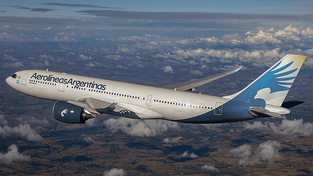
Incredible as it may seem, Argentine national carrier Aerolíneas Argentinas corporate identity and aircraft liveries have been the subject of an interesting number of creative projects proposed by independent graphic, brand artists and talented enthusiasts.
Researching for a forthcoming story on the liveries of Aerolíneas Argentinas (IATA code: AR), I was forced to spend several hours clearing the chaff from the wheat while tracing the origins of nearly half a dozen independent projects circulating the World Wide Web that I’m now certain were never requested nor initiated by the carrier itself.

In addition to documenting them to clarify their “non-official” condition, below I’m also proposing a quick review of their pros and cons because, in my humble and inexpert opinion, several of them propose interesting ideas for the prospective replacement of the ruling “Nac&Pop” livery…
Long live the condor!
Interestingly enough, all five proposals researched are faithful to the carrier’s founding icon, the condor, although few of them manage (more or less successfully) to maintain the “Vultur Gryphus” grandiose wings and distinctive head physiognomy.

This independent design trend appears to have been set in motion in 2004 by one R. P. Abraham, whose “life-long fascination with the aviation industry [led him] to design new liveries for commercial airlines, to demonstrate branding opportunities for these carriers” as stated in a surviving copy of his original site, airlineimage.com.
His portfolio proposed a powerful upgrade to corporate visual identity focusing on aircraft liveries and printed materials, with limited facilities redressing layouts and no personnel uniforms details.

The most striking propositions in his aircraft livery subordinated “Aerolíneas” to “Argentinas” in company titles and highlighted the condor’s majestic wingspan and distinctive feather geometry; but it oversimplified and degraded the bird’s distinctive head physiognomy and unintentionally degraded an otherwise impressive design.
In 2012, Bolivian digital artist and business administration expert, Alejandra Amusquívar Colque, posted an Aerolíneas Argentinas brand book proposal in her personal blog, where she essentially suggested a redesigned Aerolíneas Argentinas condor isotype where the bird’s distinctive features were transformed into a pleasant (yet not too representative) generic wide wingspan feathered creature.

Argentine initiatives
Most likely unaware of preceding foreign interventions, some Argentine student designers published their own re-branding proposals in renowned creative repositories such as Domestika and Adobe’s Behance.
Andrés Garavaglia, then aspiring to a degree in design and visual communications at Lanús University, posted a new Aerolíneas Argentinas visual identity proposal in Domestika’s creative projects area in 2013.

Essentially focused on company stationery (letter sheets, envelopes, credentials and business cards), Andrés’ proposed layout also suggested renovating the condor isotype and aircraft, ground vehicles and facilities liveries in a layout blending in the new isotype.
One year later, Juane Ghiglia posted an Aerolíneas Argentinas re-branding project in Adobe’s Behance creativity repository while transiting an institutional identity design course at Buenos Aires University.

The author’s intent was to re-direct and strengthen Aerolíneas Argentinas attributes to a more national essence, conveying dynamism, security and Argentine identity values in a scenario where the company turned into a domestic (only) airline.
Ghiglia’s designs encompassed a wide range of identity items, from aircraft to advertising posters and baggage tags (but excluding personnel uniforms), and re-used several ruling graphical attributes (such as the current isotype) and colors, and stands out by completely eliminating the “Argentinas” word from company titles.
Amieva’s “opera prima”

Late in 2020, engineer, aviation enthusiast and (then) Aerolíneas Argentinas employee, Joaquín Amieva, released his personal Aerolíneas Argentinas concept identity redesign proposal in Adobe’s Behance platform, coinciding with the “airline’s 70th anniversary and the absorption of its smaller domestic subsidiary, Austral”.
Unlike the previous student essays, his project demonstrates greater knowledge of company history and a degree of elegance that could just as well compete on an equal footing with R. P. Abraham’s 2004 sketches and many proposals from costly branding consultancy firms around the world.

In addition to selecting a modern and neat font for titles and proposing a minimalist livery that seeks to highlight the condor’s magnificence, his design evolves the company’s classic logo in an emboldened and revitalized layout featuring a distinctive head with its characteristic forehead crest in counter-form to a curved, swept wing with elongated feathers at the tip.
Even though the project remains incomplete (the author promised but never published a “part 2”), it successfully implements its value proposition: Provide a “refreshed but simple [isotype] aesthetic”, faithfully balance the use of white, yellow and cerulean (the official sky-blue color variation on the Argentine flag) and apply a rounded corner font and wide-scaled letters “to increase legibility for a wide array of applications”.
Marcelo Morard and Javier “Javo” Ruberto contributed valuable background information and research for this story.

